BRANDING PORTFOLIO

SCHOOL COUNSELOR LESSONS BRANDING CASE STUDY
Project Overview
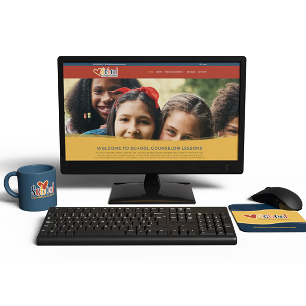
School Counselor Lessons approached us at Hickman Designs with a clear vision: to build a professional and approachable brand that connects with educators and school counselors. Our goal was to provide a complete branding package that would give School Counselor Lessons a fresh, cohesive identity across both digital and print platforms. This package included everything from a new logo and branding guide to a responsive ecommerce website and an array of branded materials.
Objectives
The main objectives for this project were to:
- Design a New Logo that communicates the brand’s dedication to guidance and learning.
- Develop a Branding Guide to ensure a unified look and feel.
- Create a Responsive Ecommerce Website with WordPress to support online sales.
- Implement SEO Strategies to boost visibility and organic reach.
- Produce Branded Collateral including event graphics, PowerPoint templates, business cards, and other marketing materials.
Solution & Implementation
1. Logo Design
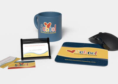
We started with the logo, aiming to capture the supportive and educational nature of School Counselor Lessons. Using symbols of guidance and growth, we created a modern, inviting logo in shades of teal, navy, and green—colors chosen to evoke trust, calm, and development. This logo became the anchor of the new brand.
2. Branding Guide
Next, we developed a comprehensive branding guide. This guide included:
- Color Palette: Primary colors in teal, navy, and green, complemented by secondary colors for versatility.
- Typography: Professional, legible fonts to maintain clarity and accessibility.
- Logo Usage Guidelines: Specifications for proper logo placement and scale.
- Tone & Voice Guidelines: Recommendations to keep messaging consistent, approachable, and professional.
The guide has been instrumental in ensuring all client communications stay on-brand.
3. Responsive WordPress Website
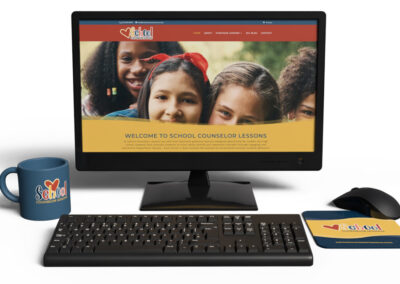
We built a custom WordPress site to serve as the core platform for School Counselor Lessons. The website is not only responsive but also includes a clean ecommerce functionality powered by WooCommerce, making it easy for customers to browse and purchase lesson plans.
Key Features:
- Ecommerce Functionality: A seamless shopping experience with easy navigation.
- Resource Library: A section where educators can find lesson materials and blog articles.
- Blog Integration: The client can post new insights and updates directly on the website.
We made sure the site was visually aligned with the brand guide and accessible across all devices.
4. Search Engine Optimization (SEO)
We wanted to make sure School Counselor Lessons would show up for key terms, so we:
- Conducted keyword research for terms like “school counselor resources” and “counseling lesson plans.”
- Optimized page titles, meta descriptions, and on-page content for SEO.
- Implemented alt tags for all images and streamlined site speed to improve ranking factors.
To broaden visibility, we also built a backlink strategy and incorporated local SEO.
5. Branded Design Pieces
- Event Graphics: We designed on-brand visuals to promote events, workshops, and webinars, featuring the established color palette and typography.
- PowerPoint Templates: We developed engaging PowerPoint templates that allow the client to create consistent, visually compelling presentations.
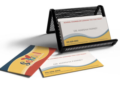
- Business Cards: Professional, stylish business cards designed for networking and educational events.
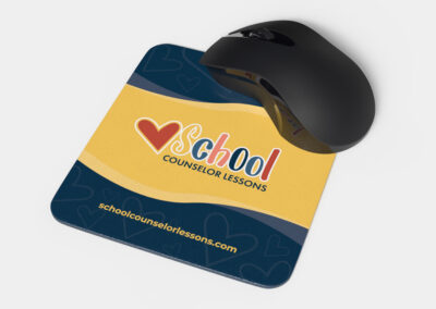
- Additional Products: Branded materials like notebooks, posters, and pamphlets to support a cohesive brand experience.
Results
Since launching the new brand, School Counselor Lessons has seen:
- Positive feedback from clients and educators who appreciate the professional look.
- A notable rise in online sales due to the improved, user-friendly ecommerce experience.
The cohesive branding has also strengthened School Counselor Lessons’ reputation in the education sector, positioning it as a reliable and well-respected resource for counselors and educators.
Conclusion
This project highlighted our commitment at Hickman Designs to create a brand that aligns perfectly with a client’s goals and audience. We’re proud of the results we’ve achieved for School Counselor Lessons, and their success reinforces our belief in the power of cohesive, strategic branding.
NORTHERN EDGE FISHING CHARTERS PROJECT OVERVIEW
Client Overview
Business Name: Northern Edge Fishing Charters
Industry: Recreational Fishing
Location: Coastal region of Maine
Services Offered: Guided fishing trips, equipment rental, and fishing gear sales
Project Overview
Northern Edge Fishing Charters sought to revamp its branding to attract a broader audience and enhance its online presence. The project focused on creating a responsive website, a new logo, and associated print materials. Hickman Designs was tasked with delivering a comprehensive branding package that included both digital and print assets.
Objectives
- Develop a modern, responsive website that showcases services and engages users.
- Create a memorable and unique logo that reflects the essence of the brand.
- Design print materials (brochures, business cards, etc.) that align with the new branding.
- Implement SEO strategies to improve online visibility.
- Utilize analytics tools to monitor website performance and user engagement.
Process
1. Research and Discovery
Hickman Designs conducted interviews with Northern Edge Fishing Charters’ stakeholders to understand their vision, values, and target audience. Market research was also performed to analyze competitors and identify design trends within the fishing charter industry.
2. Logo Design
Using Adobe Illustrator, Hickman Designs created several logo concepts. The final design features a stylized compass, symbolizing the connection between fishing, navigation and the ocean. The color palette combines deep blues and vibrant greens to evoke a sense of adventure and nature.
3. Responsive Web Design
A WordPress CMS was chosen for its flexibility and ease of use. The website design process included:
- Wireframing: Initial layouts were created to determine the structure of the site.
- Visual Design: Adobe Photoshop was used to finalize graphics and imagery that align with the brand identity.
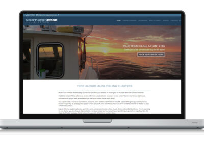
- Development: The site was built to be fully responsive, ensuring an optimal experience on desktops, tablets, and mobile devices.
- Features: Included a booking system, photo gallery, customer testimonials, and a blog for fishing tips.
4. Print Materials
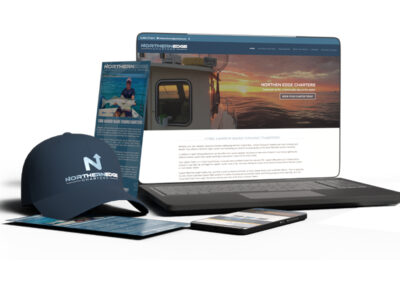
Print materials were designed to complement the new branding. This included:
Business Cards: Featuring the new logo, contact information, and a tagline.
Brochures: Highlighting services, pricing, and local fishing spots, printed on high-quality, weather-resistant paper to withstand outdoor use.
5. SEO and Analytics
Hickman Designs implemented SEO best practices, including keyword optimization and meta tagging, to improve search engine rankings. Google Analytics and Google Search Console were set up to track website performance and user behavior. Regular reports were generated to refine strategies and improve engagement.
Tools Utilized
- WordPress CMS: For website development and content management.
- Adobe Illustrator: For logo design and vector graphics.
- Adobe Photoshop: For editing images and creating web graphics.
- SEO Tools: For keyword analysis and on-page optimization.
- Google Analytics & Search Console: To monitor traffic, performance, and search visibility.
Results
- Increased Online Presence: Post-launch, the website experienced a 50% increase in organic traffic within the first three months.
- Brand Recognition: The new logo and branding materials received positive feedback from customers, enhancing brand recall.
- Improved User Engagement: The responsive design resulted in a lower bounce rate and increased time spent on the site.
- Bookings Growth: Online bookings for fishing charters increased by 30%, attributed to improved user experience and enhanced visibility.
Conclusion - The branding package developed by Hickman Designs for Northern Edge Fishing Charters successfully revitalized the company’s image, improved online engagement, and contributed to increased bookings.
- This case study highlights the importance of a cohesive branding strategy that includes digital and print elements, all supported by data-driven decisions.

